

People consume numerous services and products visually. Through the presentation of a product through ads, they can discern if the thing they want to purchase is attractive enough to buy. You might have started to notice that brands seem to follow a familiar set of palette choices depending on the service that they provide. Once you take a quick look at popular brands and their colour schemes, you’ll find a familiar connection with the way large conglomerate brands represent themselves compared to smaller companies.
Colour through presentation
Gone are the days when brands would focus solely on ad placements and pop-up ads on websites. With the development of plug-ins such as Adblock, it has made it relatively harder to reach an audience with consumers becoming smarter with how they deal with ‘unnecessary’ ads in their feeds. Brands find better ways to market their product such as having social media accounts that people can access. Products are plastered with brand logos such as pens and even clothing to make the brand a fashion statement.
The use of uniforms is one of the most timeless ways to represent a brand in physical form. Companies seek out nearby local services such as t-shirt printing in Birmingham for their uniforms to cut back on shipping costs from foreign suppliers. Having a person wear the brand allows for a more natural way to deliver brand recognition through movement and personification.
Taking the lead: passionate colours
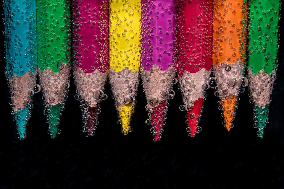
It’s alarming how brands can learn from each other and gain from the success of others. They take more from each other than what people notice which makes them almost like siblings fighting to get your attention. Regarding similarity, restaurants often use vibrant colours such as reds, yellows, and blues, that are reflective of ‘passionate’ colours that show confidence and are statistically shown to increase an individual’s appetite. Leading brands that make use of vibrant primary colours are restaurants such as Pizza Hut, Burger King and McDonald’s.
Warmth and calmness: cool colours
Blues and greens are part of the opposite of the warm colour schemes of reds and yellows which make them known collectively as part of the ‘cool colour’ shades. These colours are often the shade of choice for hospitals and insurance companies. The soothing effect of the tones is a great representative of what service they offer; depicting relaxation and peace of mind.
Simple, yet elegant: shades of light and dark
The colour black can be seen in positive and negative aspects, from being a reminder of death to a symbol of luxury. White as its compliment also has both positive and negative connotations with death and expensive products, but together they can represent a sense of authority and knowledge of professionalism. Photography studios make use of this monochromatic scheme to reflect their precision in providing a service that’s both regarding positives and negatives (alluding to white balance in photos). Clubs and high-profile restaurants are also a fan of the black and white combination.
Image: Pixabay.com